- Client: London-based quant macro research firm
- Timeline: 10 weeks
- Team: 2 engineers + 1 designer + 1 quant liaison on the client side
- Outcome: 3 production dashboards, 12 daily users on launch, migration framework now used in-house
The client and the challenge
The research desk had built a working risk analytics stack inside Jupyter: factor exposures, return attribution, rolling correlations, exposure distributions, transition matrices. The notebooks were correct, peer-reviewed, and trusted internally. They were also unusable by anyone outside the three quants who maintained them. Portfolio managers asked questions over Slack, an analyst opened a notebook, re-ran a cell, exported a PNG, pasted it back. The desk was the dashboard.
The brief: lift that stack into a tool the whole investment team could open in a browser, filter on their own, and consume without bothering the quants. Six chart families in the first cut, three sectional dashboards, mobile usability for PMs checking exposures on the move, and a clean path to migrate the remaining notebooks in the backlog.
What we built
We shipped a multi-section Retool app fronted by a thin Postgres cache layer over the firm's existing risk model API. The dashboard surfaces output across the firm's macro-factor universe (US Macro, US Macro Markets, APAC Macro Markets, EU Macro Markets) for any instrument the research desk has approved.
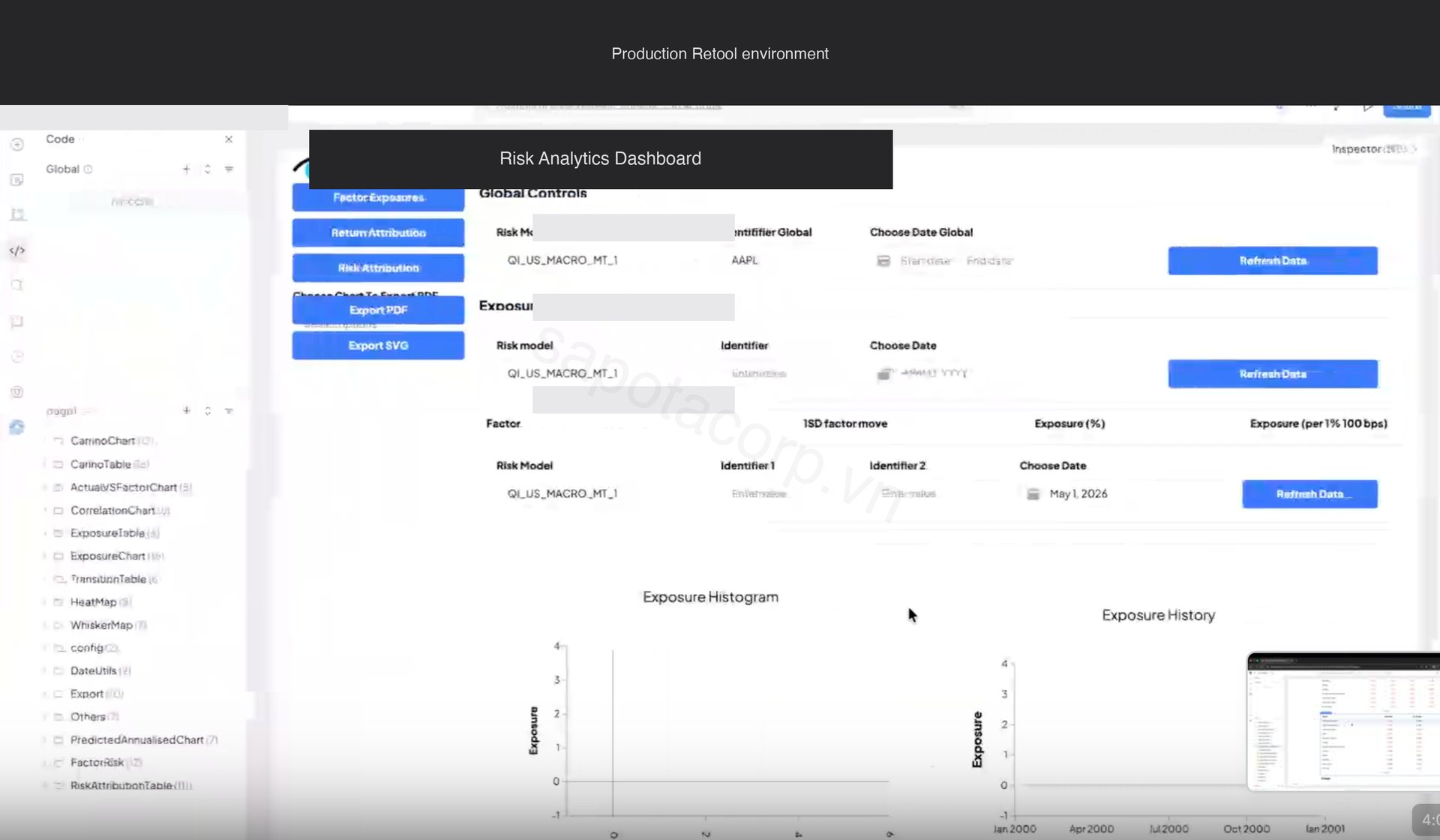
Three sectional tabs group the charts by use case: Risk Attribution (what is driving today's risk), Return Attribution (what drove yesterday's return), and Factor Exposures (where the book sits versus history). Global Controls at the top hold the active risk model, instrument, and date range, which persist across all three tabs. PDF and SVG export sits in the left rail.
The Return Attribution tab is the home screen for portfolio managers. It overlays realized cumulative return against factor-attributed return, with day-by-day bars below showing where the gap came from.
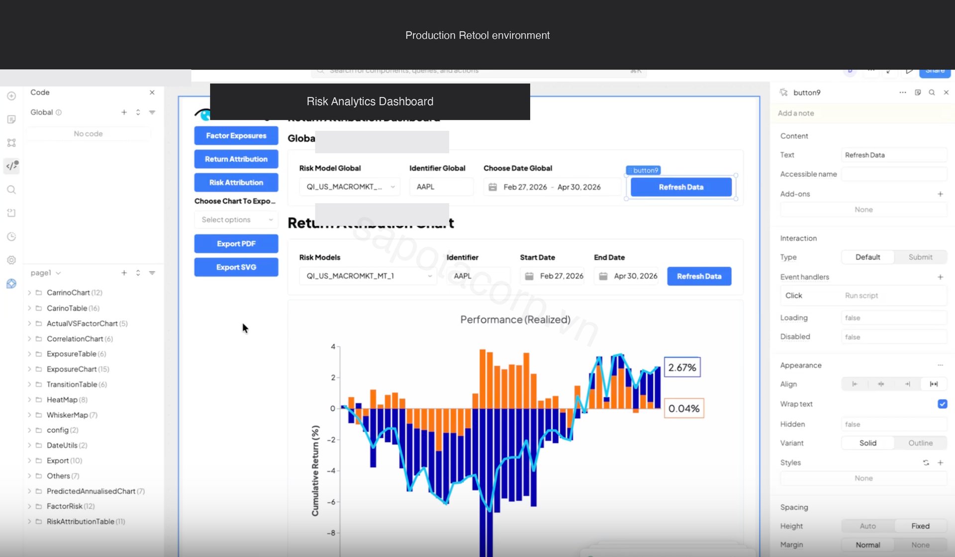
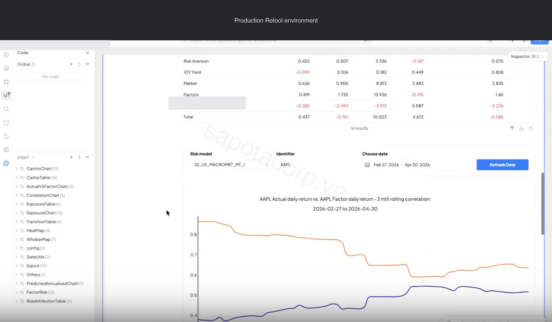
The matching chart on the same tab is the three-month rolling correlation between actual daily return and factor-implied daily return, paired with a Carino-style decomposition of contribution by factor group. This is the chart PMs look at to answer "is my book still behaving the way the model says it should."
Behind the canvas
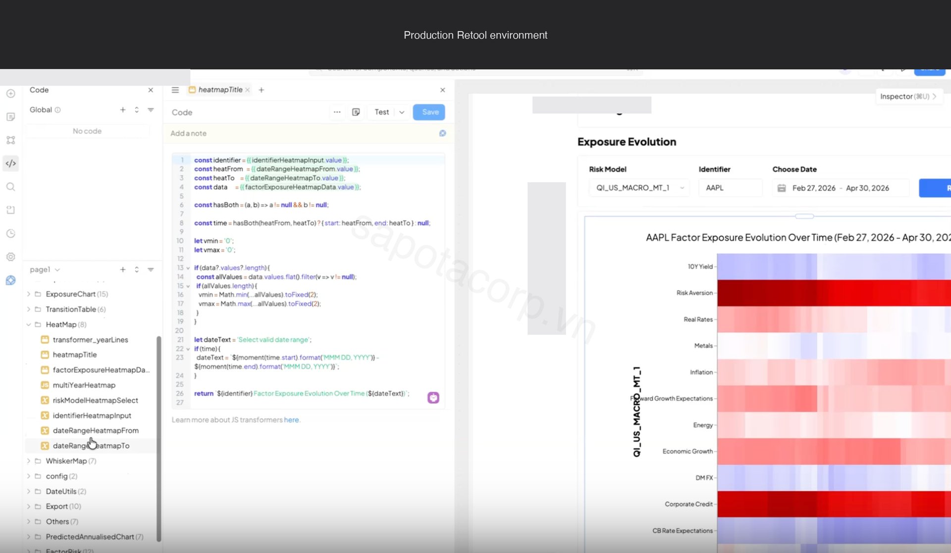
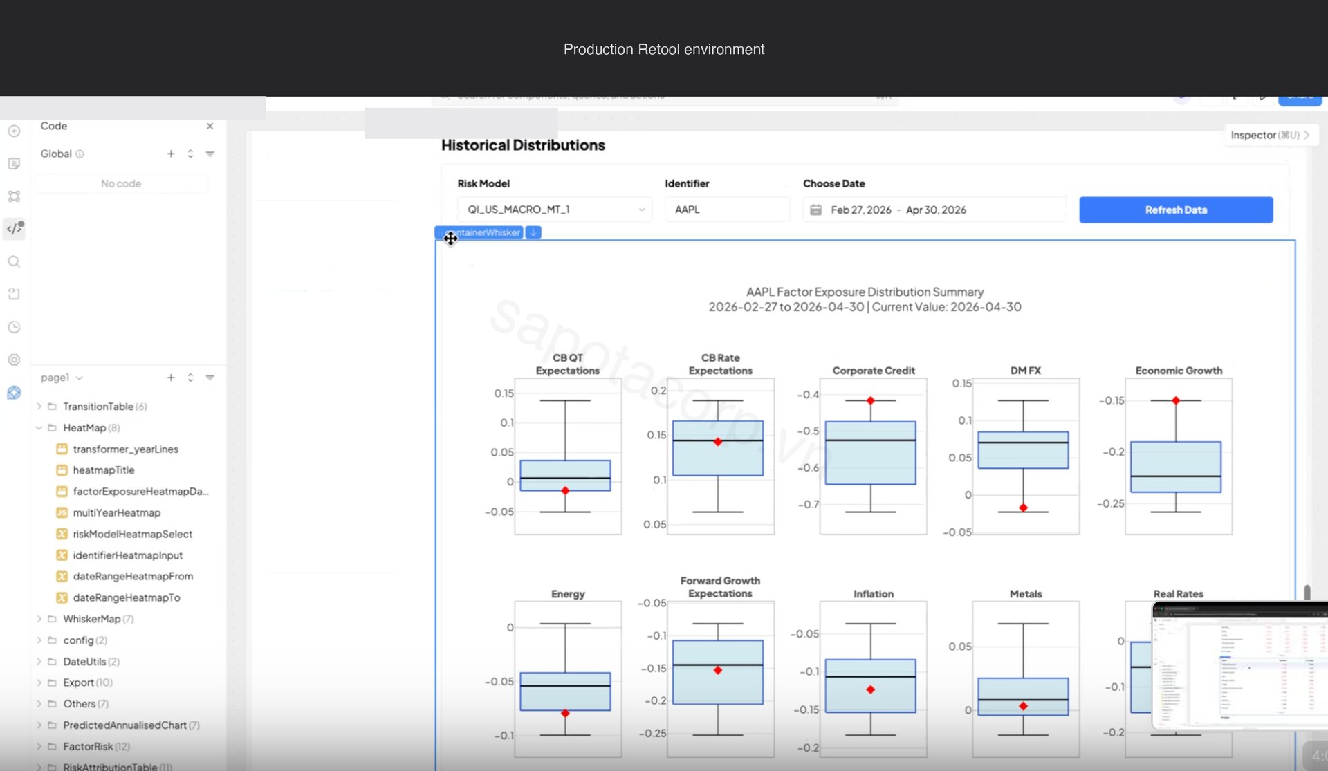
Six chart families render across the three tabs: correlation matrix, exposure heatmap, whisker distribution, exposure table, exposure histogram, and transition matrix. Each is driven by a different endpoint shape on the upstream risk model API.
Some chart types sit beyond Retool's native Chart component: heatmaps with date breaks, whisker plots with overlaid distribution percentiles, correlation matrices with clustering. For those we ship a single Retool Custom Component that wraps Plotly, with a uniform data schema every advanced chart in the app consumes. One iframe handshake, six chart types, consistent theming.
The whisker distribution chart works the same way: one Custom Component, one data schema, ten factor plots rendered in a grid showing where the current factor exposure sits inside its historical distribution.
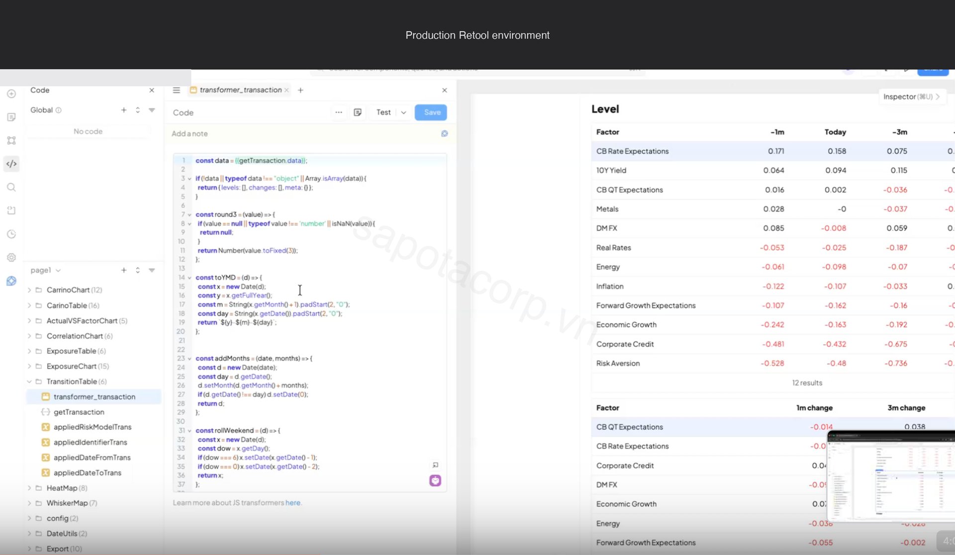
Every chart in the app calls a JS transformer query first to coerce raw API output into the schema the Custom Component expects. Centralizing the transformer rather than embedding logic per chart is the reason the app stayed clean past thirty queries.
The architecture that made it work
The risk model API has a one-year query window per call. A single Factor Exposures page can fan out to twelve API calls if a PM picks five instruments across three models and a two-year lookback. Without a cache layer the dashboard would melt the firm's quota on the third user.
We built a three-tier cache in Postgres before any Retool chart got drawn:
- Hot intraday (5-minute TTL) for queries touching the current business day. About 70% of cache hits.
- End-of-day historical (24-hour TTL) for queries strictly in closed historical days. About 25% of hits.
- Cold backfill (7-day TTL) for queries older than 90 days. A five-year backfill that would have hit the API 20 times now hits Postgres once.
Cache invalidation runs on a webhook from the firm's risk pipeline. When a model finalizes a day, the cache flushes the relevant rows and the next query repopulates. PMs do not see stale data, and the quants do not see their API quota spike when the dashboard opens on a busy morning.
Auth is Okta SSO with role membership mapped from Okta group claims. Four roles: portfolio manager (own book only), analyst (everything), quant researcher (raw factor returns), admin (audit log). Role checks are enforced at the Retool query layer, not just in the UI, so a curious PM cannot inspect the network tab and find someone else's exposures.
What the project delivered
- 3 production dashboards with 6 chart families, shared global filters, deep links via URL parameters
- Custom Retool Component wrapping Plotly for the advanced visualizations the canvas could not render natively
- Postgres cache layer with three-tier TTL, webhook-driven invalidation
- SSO and role-gated query layer mapped from Okta groups, with RBAC enforced at the query layer rather than the UI
- Scheduled morning brief at 7am UTC: a Retool Workflow that generates per-PM PDF snapshots and ships via SendGrid
- Mobile responsive layout for the three or four charts PMs check between meetings
- Audit log table with weekly partitioning and a 90-day archive job, sized for compliance from day one
- A migration framework (one-page document, three reusable app templates, the cache schema) that the firm has since used to port two more notebooks (sector concentration and stress test) without our involvement
The dashboard is no longer a Sapota deliverable. It is a Sapota-shaped capability inside the team.
Why Retool (and not a custom React build)
The same dashboard built from scratch in React with a custom backend, designer-led component library, auth integration, and infrastructure setup would have been twenty-four to thirty weeks for the same four-person team. Retool saved roughly 60% of the calendar.
The trade is real. Retool's Custom Component iframe overhead is non-trivial. The eager query evaluation needs care past about thirty queries per app. The date range chunking for the API's one-year window required a JS query we wrote ourselves. None of these are deal-breakers, but they are the kind of thing that surprises teams expecting "Retool ships everything in a week."
The framing that fits this project: Retool is the right answer when the work is orchestration over an existing API rather than data engineering, when 85% of the UI is standard dashboard pattern, and when the team accepts custom React for the bespoke 15%. On those criteria, this project was a clean Retool fit.
If you are evaluating Retool for a data tool
Sapota offers a two-week Retool viability assessment that takes your data, user roles, compliance bar, and existing notebook or script backlog, and surfaces which workloads belong on Retool, which need a custom build, and where the migration framework would land. We have shipped Retool apps for quant research desks, ops teams, fraud review queues, and partnership operations across fintech, e-commerce, and SaaS.
Reach out via the Retool and internal tools page with a description of what you are migrating and what your auth and compliance constraints look like. The first conversation usually clarifies whether Retool is the right fit within thirty minutes.


 Mobile